:root { --ink: #171717; --muted: #68645d; --cream: #f7f1e7; --white: #fffdf9; --red: #c94535; --red-dark: #9f2e25; --gold: #d6a54e; --line: rgba(23,23,23,.16); --display: "Barlow Condensed", Impact, sans-serif; --body: "DM Sans", Arial, sans-serif; } * { box-sizing: border-box; } html { scroll-behavior: smooth; } body { margin: 0; color: var(--ink); background: var(--cream); font-family: var(--body); font-size: 16px; line-height: 1.5; } a { color: inherit; text-decoration: none; } button { font: inherit; } img { display: block; max-width: 100%; } .container { width: min(1240px, calc(100% - 56px)); margin: 0 auto; } .site-header { position: relative; z-index: 20; background: var(--white); border-bottom: 1px solid var(--line); } .nav { display: flex; align-items: center; justify-content: space-between; min-height: 82px; gap: 28px; } .brand { display: inline-flex; align-items: center; gap: 12px; font-family: var(--display); font-size: 25px; font-weight: 700; letter-spacing: .01em; text-transform: uppercase; white-space: nowrap; } .brand-mark { display: grid; place-items: center; width: 39px; height: 39px; color: var(--white); background: var(--red); border-radius: 50%; font-family: var(--display); font-size: 18px; letter-spacing: -.05em; } .nav-links { display: flex; align-items: center; gap: 34px; } .nav-links a { position: relative; padding: 29px 0 25px; font-size: 13px; font-weight: 700; letter-spacing: .08em; text-transform: uppercase; } .nav-links a::after { position: absolute; right: 0; bottom: 17px; left: 0; height: 3px; background: var(--red); content: ""; transform: scaleX(0); transform-origin: right; transition: transform .25s ease; } .nav-links a:hover::after, .nav-links a:focus-visible::after, .nav-links a[aria-current="page"]::after { transform: scaleX(1); transform-origin: left; } .nav-button { display: inline-flex; align-items: center; gap: 8px; padding: 12px 17px; color: var(--white); background: var(--red); border-radius: 999px; font-size: 12px; font-weight: 700; letter-spacing: .08em; text-transform: uppercase; transition: background .2s ease, transform .2s ease; } .nav-button:hover, .nav-button:focus-visible { background: var(--red-dark); transform: translateY(-2px); } .menu-button { display: none; border: 0; background: transparent; cursor: pointer; font-size: 12px; font-weight: 700; letter-spacing: .08em; text-transform: uppercase; } .category-hero { position: relative; overflow: hidden; color: var(--white); background: var(--ink); } .category-hero::before { position: absolute; inset: 0; background: linear-gradient(90deg, rgba(23,23,23,.95) 0%, rgba(23,23,23,.8) 44%, rgba(23,23,23,.2) 100%); content: ""; z-index: 1; } .category-hero-bg { position: absolute; inset: 0; background-position: center; background-size: cover; opacity: .92; transform: scale(1.03); } .category-hero-inner { position: relative; z-index: 2; display: grid; grid-template-columns: 1fr .72fr; align-items: end; min-height: 590px; gap: 60px; padding: 92px 0 78px; } .eyebrow { display: inline-flex; align-items: center; gap: 12px; margin: 0 0 22px; color: #f1c775; font-size: 12px; font-weight: 700; letter-spacing: .17em; text-transform: uppercase; } .eyebrow::before { width: 30px; height: 3px; background: var(--red); content: ""; } h1, h2, h3 { font-family: var(--display); font-weight: 700; letter-spacing: -.045em; line-height: .86; } h1 { max-width: 780px; margin: 0 0 26px; font-size: clamp(5.7rem, 12vw, 11.5rem); text-transform: uppercase; } h1 span { display: block; color: #f1c775; } .hero-intro { max-width: 500px; margin: 0; color: rgba(255,253,249,.78); font-size: 17px; } .hero-stamp { align-self: end; max-width: 285px; padding: 25px; border: 1px solid rgba(255,253,249,.35); background: rgba(255,253,249,.1); backdrop-filter: blur(7px); } .hero-stamp strong { display: block; margin-bottom: 9px; color: var(--white); font-family: var(--display); font-size: 47px; line-height: .84; text-transform: uppercase; } .hero-stamp p { margin: 0; color: rgba(255,253,249,.72); font-size: 13px; } .category-nav { border-bottom: 1px solid var(--line); background: var(--white); } .category-nav-inner { display: flex; align-items: center; justify-content: space-between; gap: 20px; min-height: 72px; } .category-nav-label { color: var(--muted); font-size: 11px; font-weight: 700; letter-spacing: .14em; text-transform: uppercase; } .category-nav-links { display: flex; flex-wrap: wrap; justify-content: end; gap: 22px; } .category-nav-links a { color: var(--muted); font-size: 11px; font-weight: 700; letter-spacing: .1em; text-transform: uppercase; transition: color .2s ease; } .category-nav-links a:hover, .category-nav-links a:focus-visible, .category-nav-links a[aria-current="page"] { color: var(--red); } .recipe-section { padding: 108px 0 118px; } .section-heading { display: flex; align-items: end; justify-content: space-between; gap: 40px; margin-bottom: 44px; } .section-heading h2 { max-width: 680px; margin: 0; font-size: clamp(4.5rem, 8.5vw, 8.7rem); text-transform: uppercase; } .section-heading h2 span { color: var(--red); } .section-heading p { max-width: 330px; margin: 0 0 5px; color: var(--muted); } .recipe-grid { display: grid; grid-template-columns: repeat(5, 1fr); gap: 13px; } .recipe-card { display: flex; min-height: 415px; flex-direction: column; border: 1px solid var(--line); background: var(--white); transition: transform .3s ease, box-shadow .3s ease, border-color .3s ease; } .recipe-card:hover, .recipe-card:focus-within { border-color: var(--red); box-shadow: 0 16px 32px rgba(23,23,23,.14); transform: translateY(-6px); } .recipe-visual { position: relative; height: 190px; overflow: hidden; background: linear-gradient(145deg, #291f1b, #8e3b2e 52%, #d69f4f); } .recipe-visual::after { position: absolute; inset: 0; background: linear-gradient(180deg, transparent 45%, rgba(23,23,23,.35)); content: ""; pointer-events: none; } .recipe-visual img { position: relative; z-index: 1; width: 100%; height: 100%; object-fit: cover; } .recipe-body { display: flex; flex: 1; flex-direction: column; padding: 19px 18px 20px; } .recipe-meta { display: flex; justify-content: space-between; gap: 10px; margin-bottom: 19px; color: var(--muted); font-size: 10px; font-weight: 700; letter-spacing: .1em; text-transform: uppercase; } .recipe-body h3 { margin: 0 0 9px; font-size: clamp(2.35rem, 3vw, 3.4rem); text-transform: uppercase; } .recipe-body p { margin: 0; color: var(--muted); font-size: 13px; line-height: 1.45; } .recipe-link { display: inline-flex; align-items: center; gap: 8px; margin-top: auto; padding-top: 20px; color: var(--red); font-size: 11px; font-weight: 700; letter-spacing: .1em; text-transform: uppercase; } .recipe-link span { transition: transform .2s ease; } .recipe-card:hover .recipe-link span { transform: translateX(5px); } .marquee { overflow: hidden; color: var(--white); background: var(--ink); } .marquee-track { display: flex; width: max-content; gap: 28px; padding: 23px 0; animation: move 25s linear infinite; } .marquee-item { display: inline-flex; align-items: center; gap: 28px; font-family: var(--display); font-size: 31px; letter-spacing: .02em; text-transform: uppercase; white-space: nowrap; } .marquee-item::after { width: 9px; height: 9px; border-radius: 50%; background: var(--red); content: ""; } @keyframes move { to { transform: translateX(-50%); } } .table-cta { padding: 106px 0 116px; color: var(--white); background: var(--red); } .table-cta-inner { display: flex; align-items: end; justify-content: space-between; gap: 30px; } .table-cta h2 { max-width: 770px; margin: 0; font-size: clamp(4.5rem, 10vw, 10rem); text-transform: uppercase; } .table-cta h2 span { display: block; color: var(--ink); } .table-cta .button { display: inline-flex; align-items: center; justify-content: center; gap: 9px; min-width: 245px; min-height: 84px; padding: 0 32px; color: var(--ink); background: var(--white); border: 2px solid var(--white); box-shadow: 0 12px 0 rgba(23,23,23,.16); font-size: 16px; font-weight: 700; letter-spacing: .13em; text-transform: uppercase; white-space: nowrap; transition: transform .25s ease, color .25s ease, background .25s ease, border-color .25s ease, box-shadow .25s ease; } .table-cta .button:hover, .table-cta .button:focus-visible { color: var(--white); background: var(--ink); border-color: var(--ink); box-shadow: 0 12px 0 rgba(23,23,23,.2), 0 0 0 9px rgba(255,253,249,.18), 0 0 34px rgba(255,253,249,.42); transform: translateY(-5px) scale(1.04); } footer { padding: 34px 0; color: rgba(255,255,255,.7); background: var(--ink); } .footer-inner { display: flex; align-items: center; justify-content: space-between; gap: 25px; } footer .brand { color: var(--white); font-size: 22px; } .footer-links { display: flex; gap: 24px; font-size: 12px; font-weight: 700; letter-spacing: .08em; text-transform: uppercase; } .footer-links a:hover { color: var(--red); } .copyright { font-size: 12px; } @media (max-width: 1100px) { .recipe-grid { grid-template-columns: repeat(3, 1fr); } } @media (max-width: 900px) { .nav { min-height: 72px; } .nav-links { display: none; } .menu-button { display: block; } .nav.menu-open .nav-links { position: absolute; top: 72px; right: 28px; left: 28px; display: grid; gap: 0; padding: 12px 20px; border: 1px solid var(--line); background: var(--white); box-shadow: 0 15px 35px rgba(23,23,23,.14); } .nav.menu-open .nav-links a { padding: 15px 0; border-bottom: 1px solid var(--line); } .nav.menu-open .nav-links a:last-child { border-bottom: 0; } .nav-button { display: none; } .category-hero-inner { grid-template-columns: 1fr; min-height: 610px; align-items: start; } .hero-stamp { align-self: start; } .category-nav-inner { align-items: start; flex-direction: column; justify-content: center; padding: 18px 0; } .category-nav-links { justify-content: start; } .section-heading { display: block; } .section-heading h2 { margin-bottom: 20px; } .section-heading p { max-width: 480px; } .table-cta-inner { display: block; } .table-cta .button { margin-top: 30px; } } @media (max-width: 600px) { .container { width: min(100% - 30px, 1240px); } .brand { font-size: 21px; } .brand-mark { width: 34px; height: 34px; font-size: 16px; } h1 { font-size: clamp(5rem, 23vw, 7.2rem); } .category-hero-inner { padding-top: 74px; } .recipe-section { padding: 80px 0; } .section-heading h2 { font-size: clamp(4.4rem, 20vw, 7rem); } .recipe-grid { grid-template-columns: 1fr; } .recipe-card { min-height: 385px; } .table-cta h2 { font-size: clamp(4.7rem, 20vw, 7.2rem); } .footer-inner { align-items: start; flex-direction: column; } .footer-links { flex-wrap: wrap; } } @media (prefers-reduced-motion: reduce) { html { scroll-behavior: auto; } *, *::before, *::after { animation-duration: .01ms !important; animation-iteration-count: 1 !important; transition-duration: .01ms !important; } }

03 / A little challenge

Restaurant inspired.

Big presentation, smart technique, and food that makes a regular night feel like you went somewhere.

Make it feel special.

Restaurant energy without needing a reservation, a culinary degree, or a pantry full of mystery ingredients.

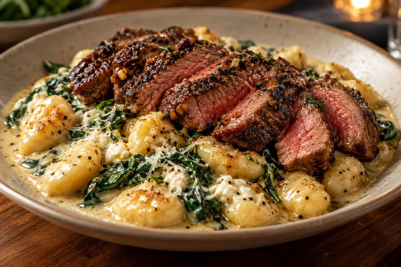
Sliced seared steak over store-bought gnocchi in creamy parmesan feta sauce with spinach
Serves 401

Steak & gnocchi

Store-bought gnocchi in heavy cream with parmesan, feta, garlic seasoning, wilted spinach, and the browned steak juices from the pan.

Recipe notes
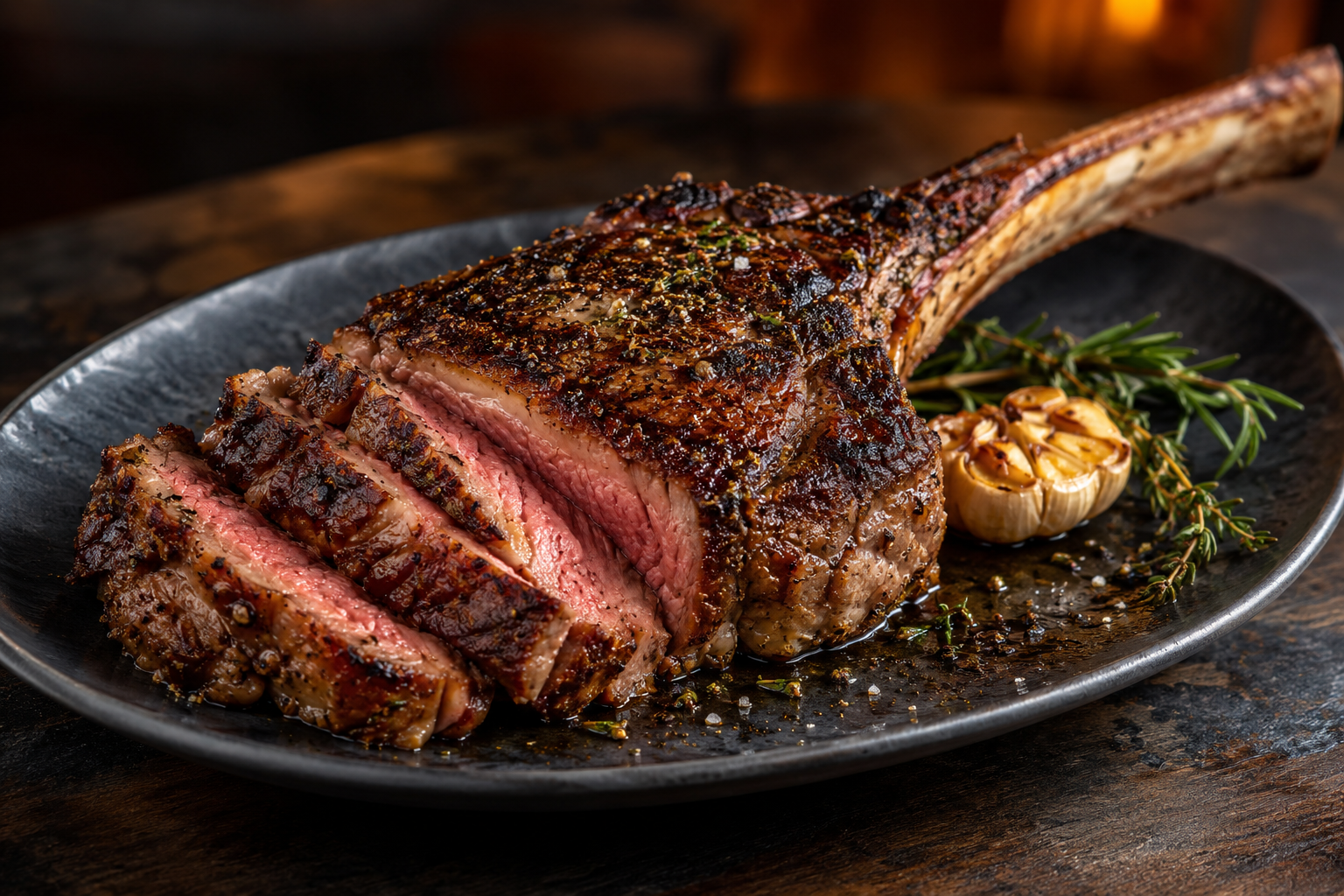
Seared tomahawk steak with a browned crust and juicy center
Serves 402

Tomahawk steak

A showpiece cut with a hard sear, a rested center, and a finish worth talking about.

Recipe notes
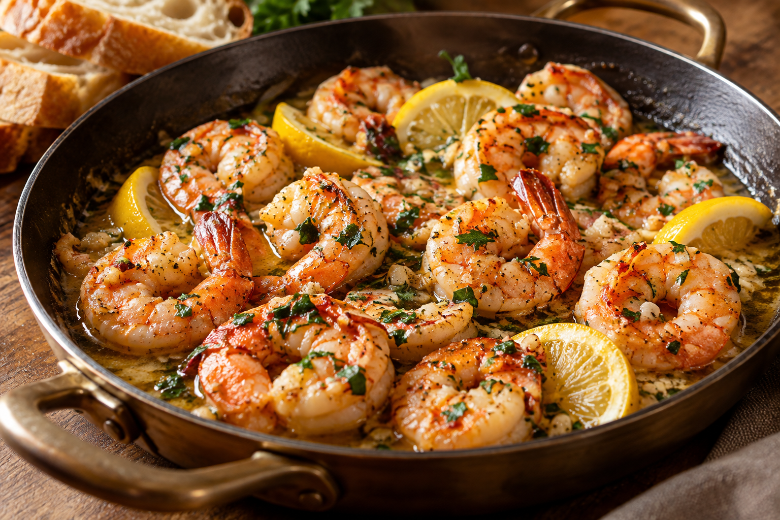
Garlic butter shrimp in a glossy golden sauce with lemon and parsley
Serves 403

Garlic butter shrimp

Fast-cooking shrimp, aromatic butter, and enough sauce to make bread mandatory.

Recipe notes
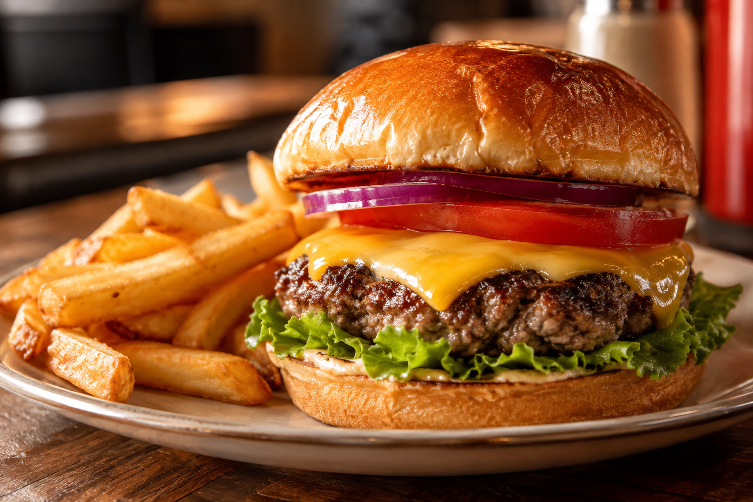
Juicy house burger with melted cheese on a toasted bun beside fries
Serves 404

The house burger

Juicy beef, a toasted bun, and the little details that make a burger feel intentional.

Recipe notes
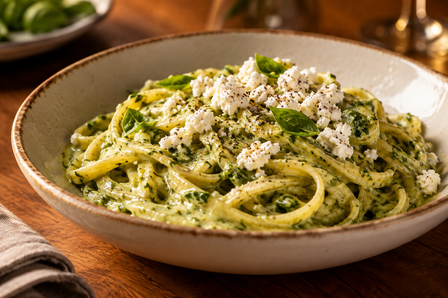
Creamy pesto pasta softened with milk and heavy cream and topped with goat cheese
Serves 405

Creamy pesto pasta

Use half milk and half heavy cream to soften the pesto, then finish with goat cheese for a sharp, bright edge.

Recipe notes

Pull up a chair.Let’s cook.

Join the table